

Luke Pearson: Showing the work brought new clients
SUCCESS STORIES
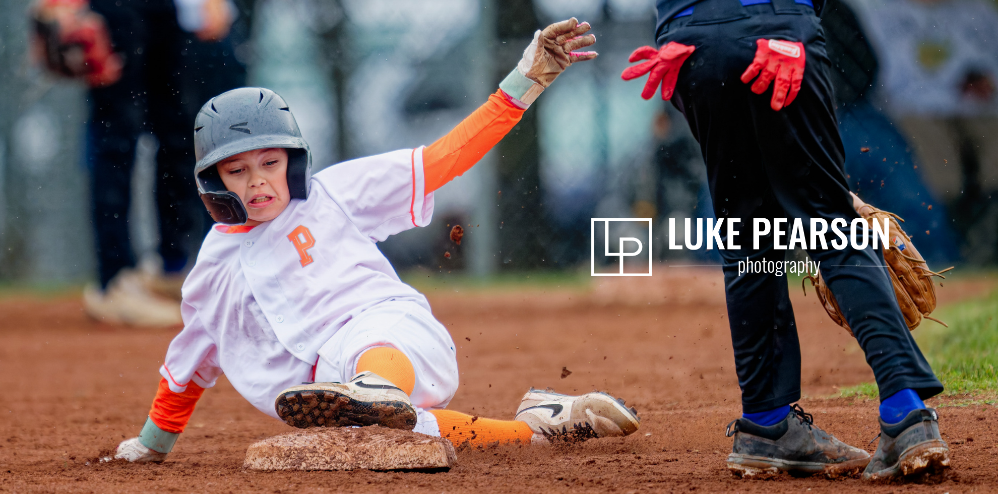
Branding services delivered:
Brand Identity & Logo Design
Visual Identity & Color System
Website Design & Copywriting
SEO Strategy
Canva Brand Template System
Squarespace & Canva Training
“The website is fantastic! We’ve received so many compliments already. We launched it on a Thursday evening, and by Monday we had received a completely cold inquiry through a Google search!”
– Erin Peth, Co-Owner, Luke Pearson Photography
He Wanted Clients Who Hang His Work on Their Walls
Luke Pearson wanted clients who hang his photographs on their walls and keep them in albums, not clients who want a digital file and move on.
His website was not set up for that. Sports and portraits lived on two separate sites, and the homepage opened on a photo of Luke. At the Texas School of Photography, he handed his website to the person next to him and asked whether they could tell, in three seconds, what he wanted to be known for. He came home knowing the portrait side had the biggest gaps. That is why he came to me: to get clear on who he is for, how to say it, and how SEO could bring those clients to him.
The work was already proven. USA Track and Field had hired him for its Masters Outdoor Championships, and a New Zealand agency had hired him to cover a Black Ferns match. His site just was not showing it.
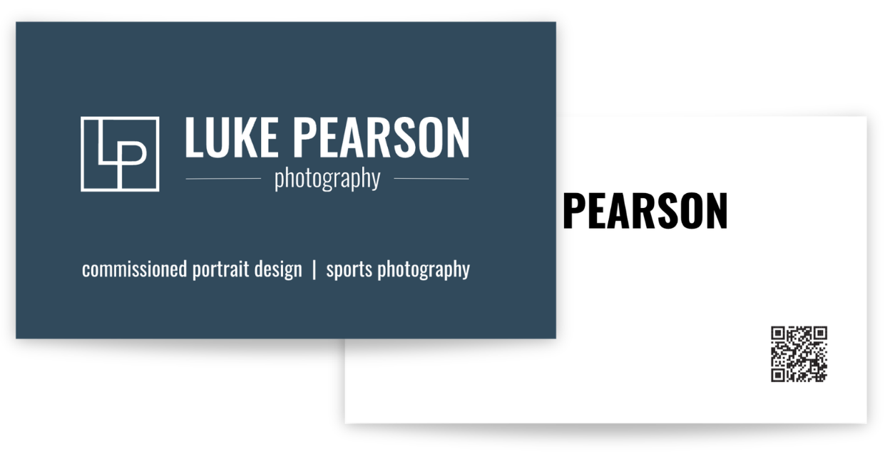
Three Breakthroughs That Defined the Brand
1. The First Thing a Visitor Sees Is Now the Work
The old homepage opened on a photo of Luke, and his images sat a couple of pages in. Visitors had to dig to see what he could do, and he leaned on other places to prove it.
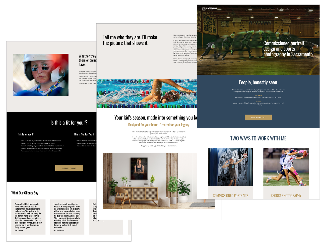
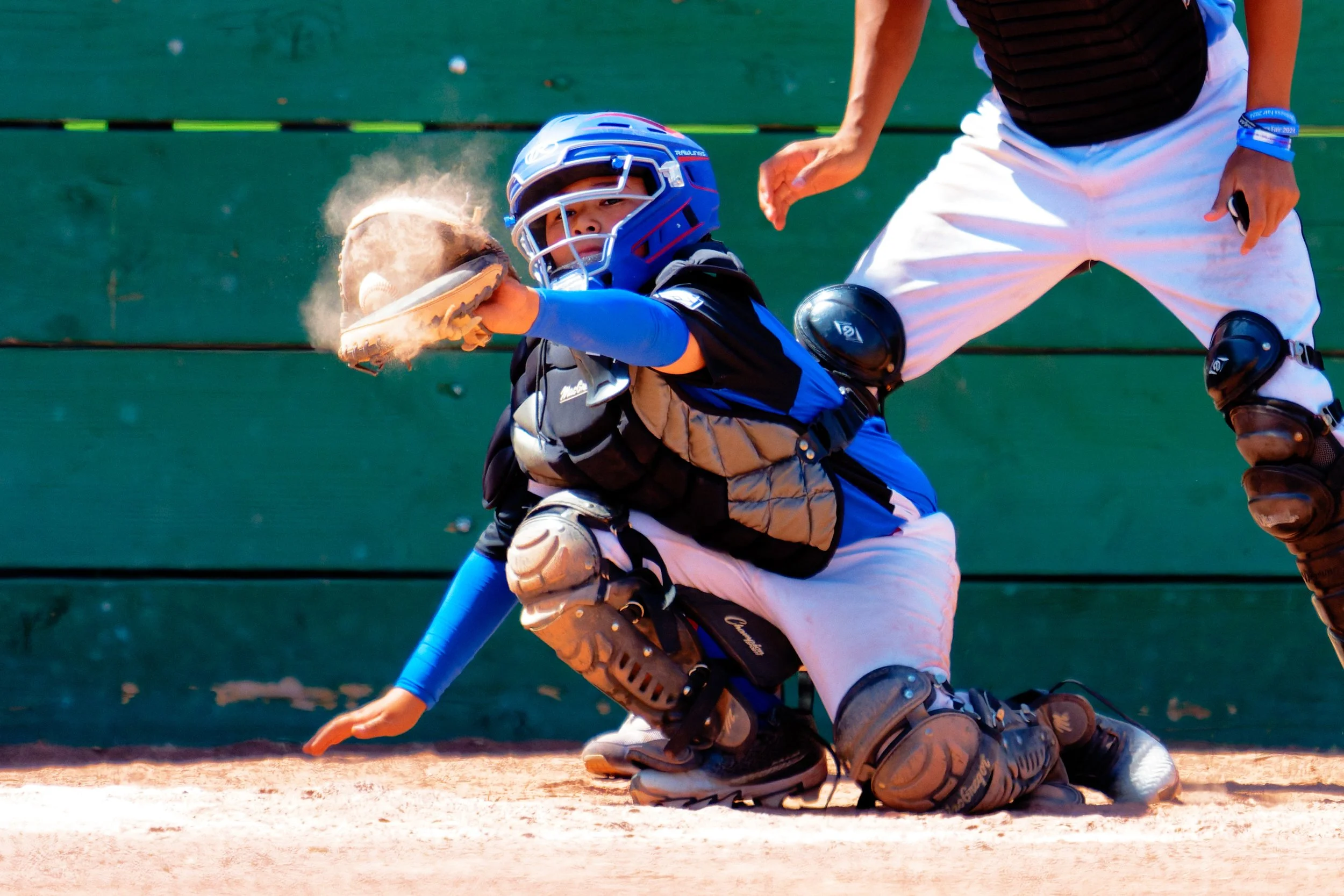
The site had been built around Luke instead of his photographs, so we flipped it. The homepage now opens on a composite that holds a sports moment and a portrait in one frame, with the logos of the organizations that have hired him as proof. His own photo moved to the About page, and the portfolio is organized into Portraits, Senior Storyline and Action Sports.
Since launch, a coach and parent found Luke through a web search, loved the images, and booked two games for team coverage.
2.One Clear Focus: Commissioned Sports Portraiture
Luke wanted to move away from sports toward broader, elevated portraiture, and his sports and portrait work lived on two separate sites.
Widening too soon would have made him look like every other Sacramento photographer, and a family searching among thousands of them would have no reason to find him in particular. His proven strength was sports portraiture, and the elevated work he wants comes from the extra time and care he puts in, whatever he is shooting. So we built one site around a single focus, "commissioned sports portraiture," and moved events and teams to their own page.
By the following Monday, a completely cold inquiry had come in through a Google search.
3. A Brand That Is Warm and Elevated at Once
The old look was dark and stark, with one corporate blue and a logo that carried several fonts. Luke wanted a brand that feels warm and human and also looks refined, and the old look did not carry that.
We kept the blue and made it less corporate, added gold for warmth, tightened the logo into one cleaner mark, and set consistent fonts. The palette and type now give a family moment its warmth and the finished piece a refined presentation.
Luke and Erin now have one consistent look and the Canva templates to keep it that way themselves. The new site has drawn compliments since launch.
Luke's first homepage was built around him, which makes sense when the person is the product. Erin put it simply: many businesses are built around the person, and theirs is different.
For a photographer, the product is the work. When the homepage shows it first, the right client knows what to do next.
For a Photographer, the Product is the Work
Business Branding Results:
From Two Websites to One Site That Brings In Clients
Brand Identity
& Logo Design
The logo Luke designed himself carried several fonts. It is now one cleaner mark with one set of fonts, so the website, his client materials and his marketing all read as the same business.
Visual Identity
& Color System
We kept his blue and made it less corporate, then added gold for warmth. A family moment now feels warm, and the finished piece looks refined.
Website Design
& Copywriting:
Two separate sites became one. The homepage opens on a composite of a sports moment and a portrait, backed by the logos of the organizations that have hired him. His own photo moved to the About page, teams and events have their own page, and every page answers the questions clients ask most.
\
SEO Strategy
The whole site is built around "commissioned sports portraiture." Structured data on six pages tells Google it is one business serving Sacramento and Roseville. Within days of launch, a cold inquiry came in through a Google search.
Canva Brand
Template System
Templates in his new colors and fonts, so anything he and Erin make keeps the same look without starting from scratch.
Squarespace
& Canva Training:
Luke and Erin can update the site and create new pieces themselves, without waiting on me.
Luke Pearson Photography Results:
From a Picture of Luke to Proof of the Work
One of the most powerful insights was discovering how much the previous brand's disconnect affected Jennifer. After seeing her new brand, she shared, "It felt so good and made me proud that the branding matched my engagement with them." This emotional alignment was a game changer, boosting her confidence in showcasing her expertise and building trust with her audience.
Brand Identity & Logo Design gave Luke one single, elegant mark to build from, replacing a multi-font DIY logo.
Visual Identity & Color System kept his signature blue but softened it, adding a new gold accent that makes room for both the sports energy and the family warmth underneath it.
Website Design & Copywriting brought two disconnected sites into one, built around his actual photography instead of around his face, with sports and portrait work sharing a single clear throughline.
SEO Strategy sharpened his positioning to "commissioned sports portraiture," language tested and chosen to be found by the clients actually searching for what he shoots.
Canva Brand Template System gives Luke and Erin a set of on-brand templates they can use themselves, so consistency doesn't depend on hiring someone every time they need a graphic.
Squarespace & Canva Training means Luke can maintain the site and the brand long after launch, without losing the polish we built in.
None of it depends on hiring someone every time Luke needs a new graphic or a fresh page. He and Erin have the templates, the training, and the language to keep building the brand themselves, the same way they've always built the business: together.


Scroll to see the website ↓
The Website ↓

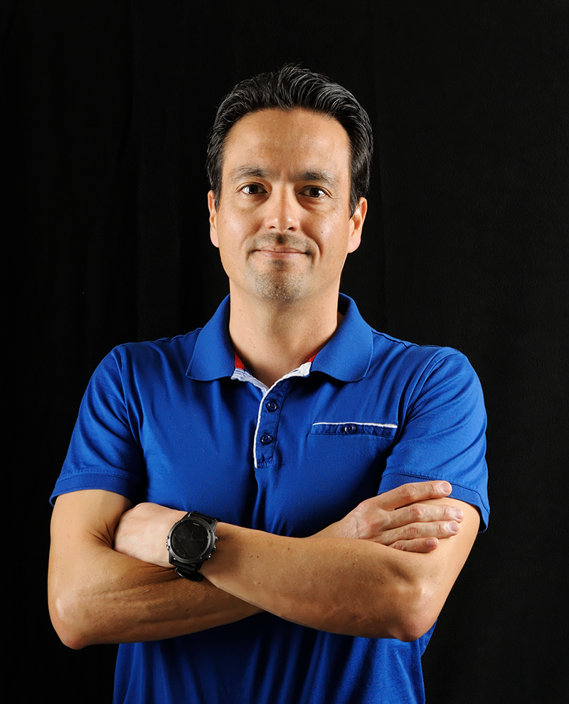
“I feel like the website is finally on the same page as where we are and where we need to be.”
– Luke Pearson, Owner & Photographer
Ready for your own business branding transformation?
If your best work is already out in the world and your website is not where people see it, this work is for you.